The Color That Sells: Chromatic Psychology Applied to Packaging
Discover how color decisions in packaging are not aesthetic — they are strategic. An evidence-based guide on how color influences the purchase decision.
Insights
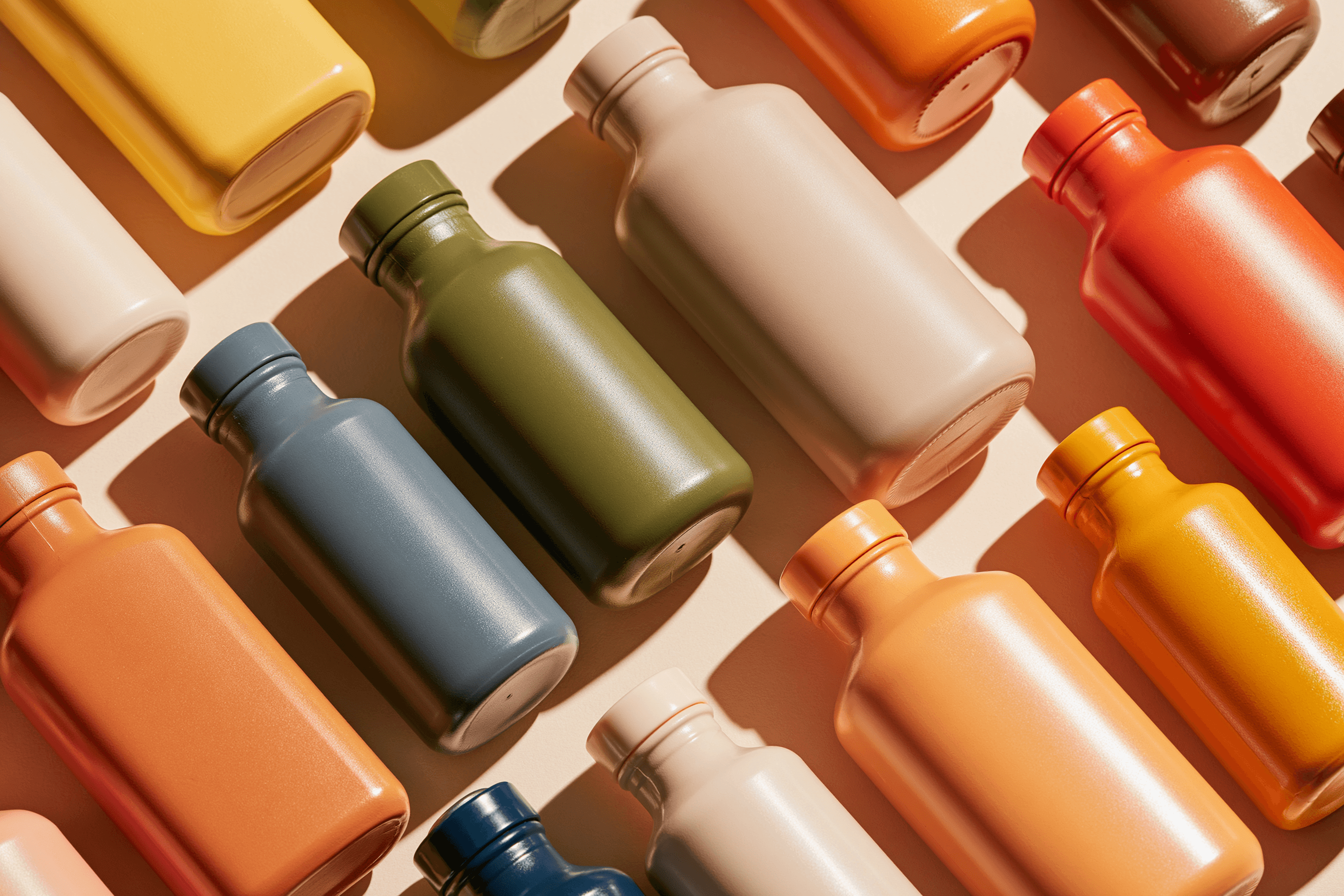
85% of purchase decisions at point of sale are influenced by color. This is not a design stat — it is a consumer behavior stat. Yet many packaging projects still choose colors based on personal taste or trend, not strategy.
In this article I analyze the role of color as a primary communication tool in packaging design, based on consumer psychology research and verifiable brand cases.

Why Does Color Communicate Before Words Do?
The human visual system processes color in approximately 90 milliseconds — long before the brain processes text or shape. In a supermarket aisle, where the average consumer makes a decision in less than 7 seconds, color is literally the brand's first message.
Research by Labrecque & Milne (2012), published in the Journal of the Academy of Marketing Science, establishes that color transmits symbolic associations that condition the perception of price, quality, and product category before any rational reading occurs.
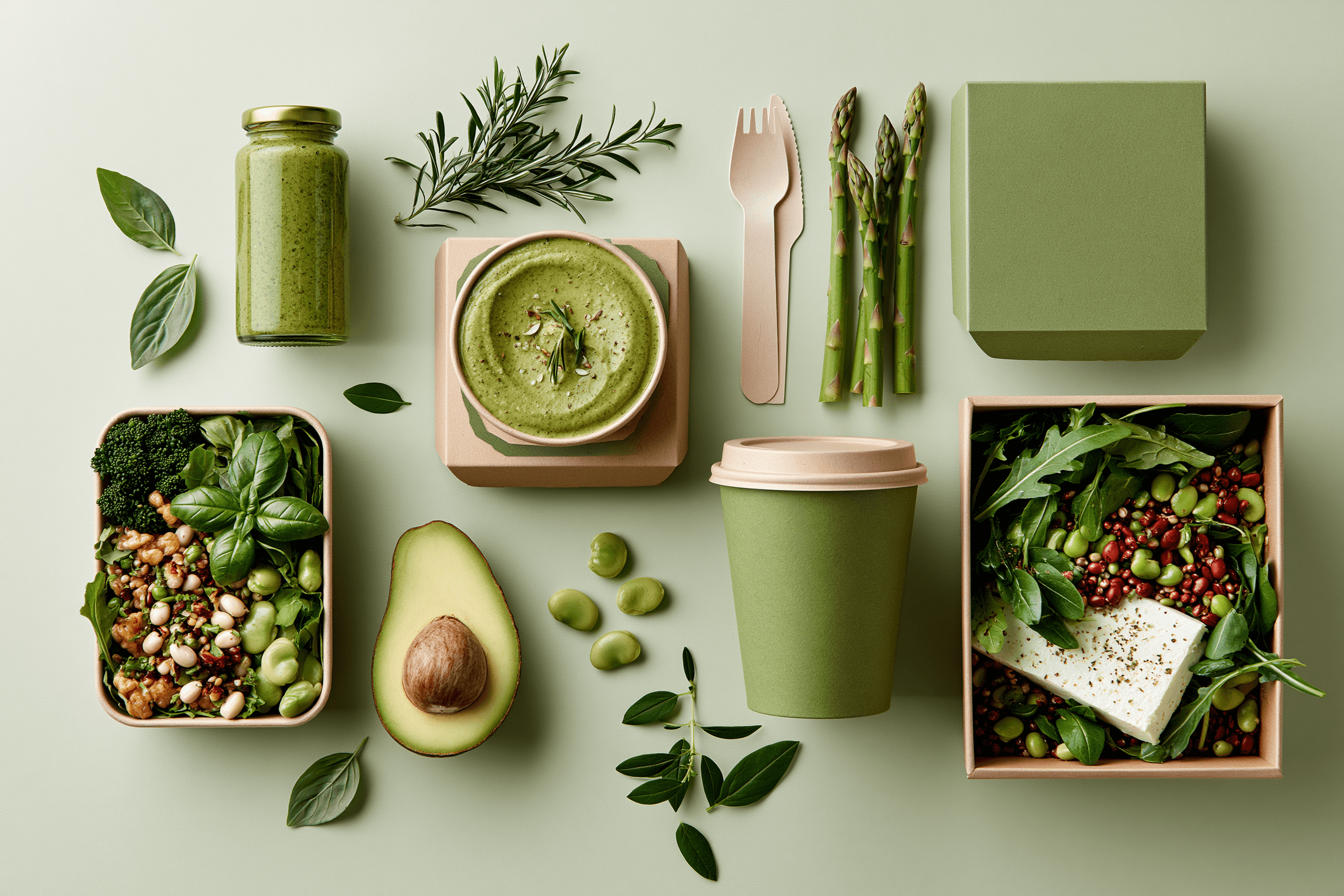
Colors by Category: What Works and Why
There is no universally "correct" color, but there are cultural category codes that consumers have already internalized:
Green: health, nature, organic products. Works in food, natural cosmetics, supplements. Verifiable reference: Alpina Colombia organic line relaunch, 2019.
Black: luxury, exclusivity, high perceived quality. Raises perceived price by up to 28% according to Bottomley & Doyle (2006) in the Journal of Marketing Management.
Yellow/Orange: energy, impulse, fast decision-making. Dominant in snacks, fast food, and sports categories.
Blue: trust, cleanliness, technology. Dominant in hygiene and pharmaceutical products.
The key is not choosing "a beautiful color" — it is choosing the color the consumer already associates with the attributes the brand wants to project.
The Most Common Mistake: Ignoring Cultural Context
White communicates purity in Western cultures, but mourning in several Asian ones. Red means luck in China and danger in international signage. A packaging project targeting export markets that ignores these differences can generate cultural rejection without ever understanding why.
Practical recommendation: if the product has international markets, the color validation process must include a cultural semiotics analysis — not just a local preference test.


Color Is a Strategic Decision, Not an Aesthetic One
The packaging that works at point of sale is not the prettiest — it is the most legible and coherent with the brand promise. Color is the first visual contract between a brand and the consumer.
Before choosing a color for your packaging, answer these three questions:
What attributes must this product communicate in 3 seconds?
What chromatic code does the category use? Do I want to follow it or break it?
In what markets and cultural contexts will this packaging live?
Sources:
Labrecque, L. I., & Milne, G. R. (2012). Exciting red and competent blue: the importance of color in marketing. Journal of the Academy of Marketing Science, 40(5), 711–727.
Bottomley, P. A., & Doyle, J. R. (2006). The interactive effects of colors and products on perceptions of brand logo appropriateness. Marketing Theory, 6(1), 63–83.
Singh, S. (2006). Impact of color on marketing. Management Decision, 44(6), 783–789. Emerald Publishing.

More to Discover

The Color That Sells: Chromatic Psychology Applied to Packaging
Discover how color decisions in packaging are not aesthetic — they are strategic. An evidence-based guide on how color influences the purchase decision.
Insights
85% of purchase decisions at point of sale are influenced by color. This is not a design stat — it is a consumer behavior stat. Yet many packaging projects still choose colors based on personal taste or trend, not strategy.
In this article I analyze the role of color as a primary communication tool in packaging design, based on consumer psychology research and verifiable brand cases.
Why Does Color Communicate Before Words Do?
The human visual system processes color in approximately 90 milliseconds — long before the brain processes text or shape. In a supermarket aisle, where the average consumer makes a decision in less than 7 seconds, color is literally the brand's first message.
Research by Labrecque & Milne (2012), published in the Journal of the Academy of Marketing Science, establishes that color transmits symbolic associations that condition the perception of price, quality, and product category before any rational reading occurs.
Colors by Category: What Works and Why
There is no universally "correct" color, but there are cultural category codes that consumers have already internalized:
Green: health, nature, organic products. Works in food, natural cosmetics, supplements. Verifiable reference: Alpina Colombia organic line relaunch, 2019.
Black: luxury, exclusivity, high perceived quality. Raises perceived price by up to 28% according to Bottomley & Doyle (2006) in the Journal of Marketing Management.
Yellow/Orange: energy, impulse, fast decision-making. Dominant in snacks, fast food, and sports categories.
Blue: trust, cleanliness, technology. Dominant in hygiene and pharmaceutical products.
The key is not choosing "a beautiful color" — it is choosing the color the consumer already associates with the attributes the brand wants to project.
The Most Common Mistake: Ignoring Cultural Context
White communicates purity in Western cultures, but mourning in several Asian ones. Red means luck in China and danger in international signage. A packaging project targeting export markets that ignores these differences can generate cultural rejection without ever understanding why.
Practical recommendation: if the product has international markets, the color validation process must include a cultural semiotics analysis — not just a local preference test.
Color Is a Strategic Decision, Not an Aesthetic One
The packaging that works at point of sale is not the prettiest — it is the most legible and coherent with the brand promise. Color is the first visual contract between a brand and the consumer.
Before choosing a color for your packaging, answer these three questions:
What attributes must this product communicate in 3 seconds?
What chromatic code does the category use? Do I want to follow it or break it?
In what markets and cultural contexts will this packaging live?
Sources:
Labrecque, L. I., & Milne, G. R. (2012). Exciting red and competent blue: the importance of color in marketing. Journal of the Academy of Marketing Science, 40(5), 711–727.
Bottomley, P. A., & Doyle, J. R. (2006). The interactive effects of colors and products on perceptions of brand logo appropriateness. Marketing Theory, 6(1), 63–83.
Singh, S. (2006). Impact of color on marketing. Management Decision, 44(6), 783–789. Emerald Publishing.
More to Discover
The Color That Sells: Chromatic Psychology Applied to Packaging
Discover how color decisions in packaging are not aesthetic — they are strategic. An evidence-based guide on how color influences the purchase decision.
Insights
85% of purchase decisions at point of sale are influenced by color. This is not a design stat — it is a consumer behavior stat. Yet many packaging projects still choose colors based on personal taste or trend, not strategy.
In this article I analyze the role of color as a primary communication tool in packaging design, based on consumer psychology research and verifiable brand cases.
Why Does Color Communicate Before Words Do?
The human visual system processes color in approximately 90 milliseconds — long before the brain processes text or shape. In a supermarket aisle, where the average consumer makes a decision in less than 7 seconds, color is literally the brand's first message.
Research by Labrecque & Milne (2012), published in the Journal of the Academy of Marketing Science, establishes that color transmits symbolic associations that condition the perception of price, quality, and product category before any rational reading occurs.
Colors by Category: What Works and Why
There is no universally "correct" color, but there are cultural category codes that consumers have already internalized:
Green: health, nature, organic products. Works in food, natural cosmetics, supplements. Verifiable reference: Alpina Colombia organic line relaunch, 2019.
Black: luxury, exclusivity, high perceived quality. Raises perceived price by up to 28% according to Bottomley & Doyle (2006) in the Journal of Marketing Management.
Yellow/Orange: energy, impulse, fast decision-making. Dominant in snacks, fast food, and sports categories.
Blue: trust, cleanliness, technology. Dominant in hygiene and pharmaceutical products.
The key is not choosing "a beautiful color" — it is choosing the color the consumer already associates with the attributes the brand wants to project.
The Most Common Mistake: Ignoring Cultural Context
White communicates purity in Western cultures, but mourning in several Asian ones. Red means luck in China and danger in international signage. A packaging project targeting export markets that ignores these differences can generate cultural rejection without ever understanding why.
Practical recommendation: if the product has international markets, the color validation process must include a cultural semiotics analysis — not just a local preference test.
Color Is a Strategic Decision, Not an Aesthetic One
The packaging that works at point of sale is not the prettiest — it is the most legible and coherent with the brand promise. Color is the first visual contract between a brand and the consumer.
Before choosing a color for your packaging, answer these three questions:
What attributes must this product communicate in 3 seconds?
What chromatic code does the category use? Do I want to follow it or break it?
In what markets and cultural contexts will this packaging live?
Sources:
Labrecque, L. I., & Milne, G. R. (2012). Exciting red and competent blue: the importance of color in marketing. Journal of the Academy of Marketing Science, 40(5), 711–727.
Bottomley, P. A., & Doyle, J. R. (2006). The interactive effects of colors and products on perceptions of brand logo appropriateness. Marketing Theory, 6(1), 63–83.
Singh, S. (2006). Impact of color on marketing. Management Decision, 44(6), 783–789. Emerald Publishing.